ENTERED IN FLUX DESIGN COMPETITION
THE TELLTALE LILAC BUSH
Overview
This layout design uses content from the 1965 collection of short stories, "The Telltale Lilac Bush," created by Ruth Ann Musick. It uses the story "The Tortured Sparrow," from chapter 14 "Animals & Birds." The layout design was inspired by the identitiy of the story itself.
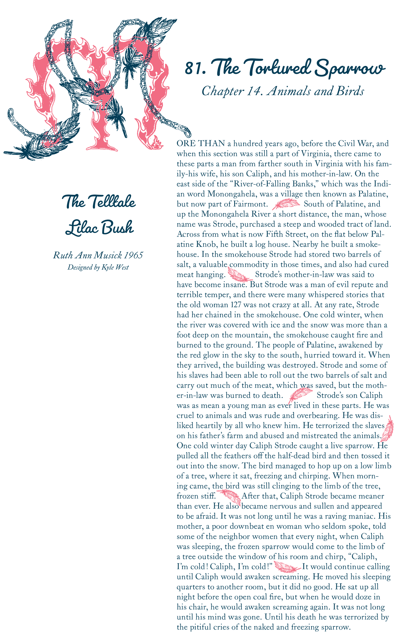
The drop cap was made in order to depict both sides of the tell tale, and the parallel between cold and warmth. Following the chain is meant to lead to the conent, the feathers to the title, and the middle of the fire to the book title and credentials. The feathers in the body copy were inspired by rubrications within medieval manuscripts, so indentation or line spacing wasn’t needed.
The typography was chosen based off of the time periods that take place in this story. Since it takes place in the late 1800's, I chose Pacifico Regular because my story said it took place “more than 100 years ago.” I initially thought of a cursive typeface, and after some digging, I found a legible cursive typeface within Pacifico. At first I wanted to have only one typeface within my design, however the cursive typeface at a small size was impossible to read. This meant I had to change my typeface into something more legible. I decided to use LTC Caslon Pro Regular because it was the Caslon font on adobe, and because I know it is one of the oldest and easiest to read serif typefaces.